Fit fidelity & analysis
22/06/21
Here we’ll look in detail at a batch of fit results (see the batch run notebook for initial setup & running fits), and stats.
TODO: final uncertainty analysis, bootstrapping and testing with noise etc.
Batch results
Generally, there are many things to consider in terms of the quality/fidelity of the fit results. In particular, we might want to investigate:
\(\chi^2\) values.
Estimated uncertainties.
Uniqueness of fit.
This is generally aided by having a large batch of fit results, with randomised initial parameters, to allow for statistical analysis and ensure a full probing of the solution hyper-space.
For further discussion, see, for example:
[1]
Hockett, Quantum Metrology with Photoelectrons, Volume 2: Applications and advances. IOP Publishing, 2018. doi: 10.1088/978-1-6817-4688-3.
[2]
Hockett, “Photoionization dynamics of polyatomic molecules,” University of Nottingham, 2009. Available: http://eprints.nottingham.ac.uk/10857/
Load sample dataset
[1]:
# If running from scratch, create a blank object first
# # Init blank object
import pemtk as pm
from pemtk.fit.fitClass import pemtkFit
data = pemtkFit()
*** ePSproc installation not found, setting for local copy.
[2]:
# Load sample dataset
# Full path to the file may be required here, in repo/demos/fitting
import pickle
from pathlib import Path

dataFile = 'dataDump_100fitTests_10t_randPhase_130621.pickle'
dataPath = Path(pm.__path__[0]).parent/Path('demos','fitting')

with open( dataPath/dataFile, 'rb') as handle:
    data.data = pickle.load(handle)
[3]:
# The sample data dictionary contains 100 fits, as well as the data used to set things up.
data.data.keys()
[3]:
dict_keys(['orb6', 'orb5', 'ADM', 'pol', 'subset', 'sim', 0, 1, 2, 3, 4, 5, 6, 7, 8, 9, 10, 11, 12, 13, 14, 15, 16, 17, 18, 19, 20, 21, 22, 23, 24, 25, 26, 27, 28, 29, 30, 31, 32, 33, 34, 35, 36, 37, 38, 39, 40, 41, 42, 43, 44, 45, 46, 47, 48, 49, 50, 51, 52, 53, 54, 55, 56, 57, 58, 59, 60, 61, 62, 63, 64, 65, 66, 67, 68, 69, 70, 71, 72, 73, 74, 75, 76, 77, 78, 79, 80, 81, 82, 83, 84, 85, 86, 87, 88, 89, 90, 91, 92, 93, 94, 95, 96, 97, 98, 99])
[4]:
# Set max fit ind for reference
data.fitInd = 99

# Set reference values from input matrix elements (data.data['subset']['matE'])
data.setMatEFit()
Set 6 complex matrix elements to 12 fitting params, see self.params for details.
| name | value | initial value | min | max | vary |
|---|---|---|---|---|---|
| m_PU_SG_PU_1_n1_1 | 1.78461575 | 1.784615753610107 | 1.0000e-04 | 5.00000000 | True |
| m_PU_SG_PU_1_1_n1 | 1.78461575 | 1.784615753610107 | 1.0000e-04 | 5.00000000 | True |
| m_PU_SG_PU_3_n1_1 | 0.80290495 | 0.802904951323892 | 1.0000e-04 | 5.00000000 | True |
| m_PU_SG_PU_3_1_n1 | 0.80290495 | 0.802904951323892 | 1.0000e-04 | 5.00000000 | True |
| m_SU_SG_SU_1_0_0 | 2.68606212 | 2.686062120382649 | 1.0000e-04 | 5.00000000 | True |
| m_SU_SG_SU_3_0_0 | 1.10915311 | 1.109153108617096 | 1.0000e-04 | 5.00000000 | True |
| p_PU_SG_PU_1_n1_1 | -0.86104140 | -0.8610414024232179 | -3.14159265 | 3.14159265 | False |
| p_PU_SG_PU_1_1_n1 | -0.86104140 | -0.8610414024232179 | -3.14159265 | 3.14159265 | True |
| p_PU_SG_PU_3_n1_1 | -3.12044446 | -3.1204444620772467 | -3.14159265 | 3.14159265 | True |
| p_PU_SG_PU_3_1_n1 | -3.12044446 | -3.1204444620772467 | -3.14159265 | 3.14159265 | True |
| p_SU_SG_SU_1_0_0 | 2.61122920 | 2.611229196458127 | -3.14159265 | 3.14159265 | True |
| p_SU_SG_SU_3_0_0 | -0.07867828 | -0.07867827542158025 | -3.14159265 | 3.14159265 | True |
Process results
Here we’ll use Seaborn and Holoviews to look at the fit results outputs from lmfit; for this, the results will first be restacked to a long-form Pandas data-frame.
[5]:
# Additional import for data analysis
import xarray as xr
import numpy as np
import pandas as pd
import string

# pd.options.display.max_rows = 50
pd.set_option("display.max_rows", 50)

# For AFBLM > PD conversion
import epsproc as ep

# For plotting
import seaborn as sns
import holoviews as hv
from holoviews import opts

# Some additional default plot settings
# TODO: should set versino for PEMtk, just sets various default plotters & HV backends.
from epsproc.plot import hvPlotters
hvPlotters.setPlotters()


[6]:
# The converter currently returns directly, not to the class.
dfLong, dfRef = data.pdConv()
[7]:
# The long-format data includes per fit and per parameter data
dfLong
[7]:
| value | stderr | vary | expr | Param | success | chisqr | redchi | |||
|---|---|---|---|---|---|---|---|---|---|---|
| Fit | Type | pn | ||||||||
| 0 | m | 0 | 1.89405 | 0.00952422 | False | m_PU_SG_PU_1_1_n1 | PU_SG_PU_1_n1_1 | True | 9.83239e-05 | 5.25796e-07 |
| 1 | 1.89405 | 0.00952422 | True | None | PU_SG_PU_1_1_n1 | True | 9.83239e-05 | 5.25796e-07 | ||
| 2 | 0.489781 | 0.0369748 | False | m_PU_SG_PU_3_1_n1 | PU_SG_PU_3_n1_1 | True | 9.83239e-05 | 5.25796e-07 | ||
| 3 | 0.489781 | 0.0369748 | True | None | PU_SG_PU_3_1_n1 | True | 9.83239e-05 | 5.25796e-07 | ||
| 4 | 2.57267 | 0.0125781 | True | None | SU_SG_SU_1_0_0 | True | 9.83239e-05 | 5.25796e-07 | ||
| ... | ... | ... | ... | ... | ... | ... | ... | ... | ... | ... |
| 98 | p | 7 | 2.46926 | 23279.8 | True | None | PU_SG_PU_1_1_n1 | True | 0.000136565 | 7.30294e-07 |
| 8 | 0.1535 | 23279.8 | False | p_PU_SG_PU_3_1_n1 | PU_SG_PU_3_n1_1 | True | 0.000136565 | 7.30294e-07 | ||
| 9 | 0.1535 | 23279.8 | True | None | PU_SG_PU_3_1_n1 | True | 0.000136565 | 7.30294e-07 | ||
| 10 | -1.04185 | 23279.8 | True | None | SU_SG_SU_1_0_0 | True | 0.000136565 | 7.30294e-07 | ||
| 11 | 2.14965 | 23279.8 | True | None | SU_SG_SU_3_0_0 | True | 0.000136565 | 7.30294e-07 |
1188 rows × 8 columns
For the fit/model results (AF-\(\beta_{LM}\) parameters), the output is an Xarray per fit, these can be stacked to a dataset for batched analysis.
[8]:
# Stack fits to Xarrays
# Don't recall the best way to do this - here pass to list then stack directly

# AFstack = xr.DataArray()
AFstack = []

for n in range(0, data.fitInd):
    AFstack.append(data.data[n]['AFBLM'].expand_dims({'Fit':[n]})) # NOTE [n] here, otherwise gives length not coord
                                                                   # http://xarray.pydata.org/en/stable/generated/xarray.DataArray.expand_dims.html

AFxr = xr.concat(AFstack,'Fit')
… and further convert to Pandas for Seaborn plotting…
[9]:
AFpd, AFxrRS = ep.multiDimXrToPD(AFxr.squeeze().pipe(np.abs), colDims=['t'],
                                 thres = 1e-4, fillna=True)

AFpdLong = AFpd.reset_index().melt(id_vars=['Fit','l','m'])  # This works for pushing to full long-format with col by t

AFpdLong
[9]:
| Fit | l | m | t | value | |
|---|---|---|---|---|---|
| 0 | 0 | 0 | 0 | 4.02 | 1.668968 |
| 1 | 0 | 2 | 0 | 4.02 | 0.924928 |
| 2 | 0 | 4 | 0 | 4.02 | 0.147711 |
| 3 | 0 | 6 | 0 | 4.02 | 0.007405 |
| 4 | 1 | 0 | 0 | 4.02 | 1.668803 |
| ... | ... | ... | ... | ... | ... |
| 5143 | 97 | 6 | 0 | 4.96 | 0.010057 |
| 5144 | 98 | 0 | 0 | 4.96 | 1.599609 |
| 5145 | 98 | 2 | 0 | 4.96 | 0.947416 |
| 5146 | 98 | 4 | 0 | 4.96 | 0.088204 |
| 5147 | 98 | 6 | 0 | 4.96 | 0.009020 |
5148 rows × 5 columns
Quick overviews
Panda’s describe() method gives some summary details, which may (or may not) be useful here.
[10]:
dfLong.describe()
[10]:
| value | stderr | vary | expr | Param | success | chisqr | redchi | |
|---|---|---|---|---|---|---|---|---|
| count | 1188.000000 | 1116.000000 | 1188 | 396 | 1188 | 1188 | 1188.000000 | 1.188000e+03 |
| unique | 790.000000 | 1116.000000 | 2 | 4 | 6 | 2 | 99.000000 | 9.900000e+01 |
| top | 3.141593 | 47132.056337 | True | m_PU_SG_PU_3_1_n1 | SU_SG_SU_3_0_0 | True | 0.000098 | 7.302939e-07 |
| freq | 3.000000 | 1.000000 | 792 | 99 | 198 | 1176 | 12.000000 | 1.200000e+01 |
\(\chi^2\)
Any datatype (column) can be plotted… here are the \(\chi^2\) histograms (note the frquencies are currently per parameter, not per fit, here).
[11]:
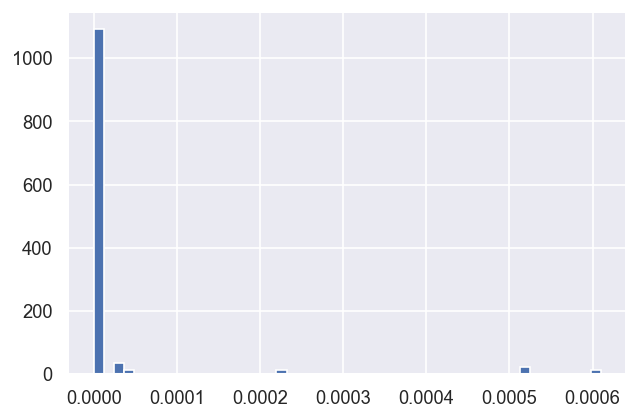
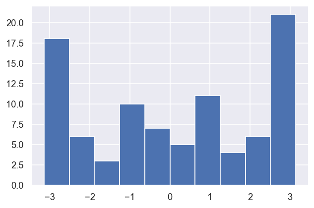
dfLong['redchi'].hist(bins=50)  # Plot redchi histogram - note this currently reports fits x params values.
# dfLong.hist(column='redchi', by='Fit')  # Should work for per-fit results, but not currently.
[11]:
<AxesSubplot:>
[12]:
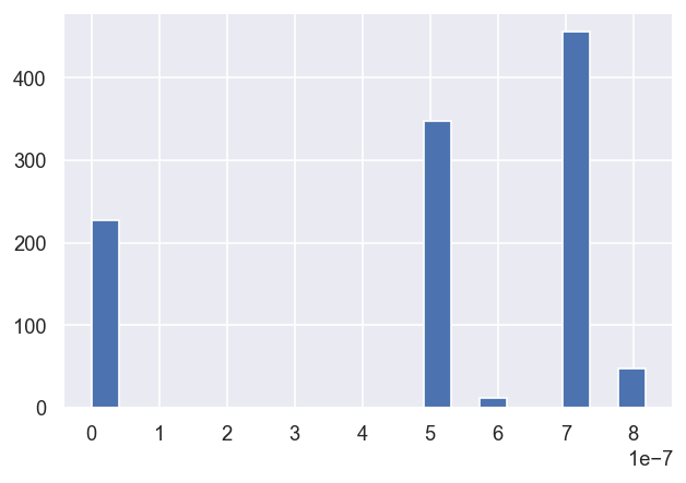
# Zoom in on the lowest set via a selection mask

mask = dfLong['redchi']<1e-5

dfLong['redchi'][mask].hist(bins=20)
[12]:
<AxesSubplot:>
[13]:
# Interactive version with Holoviews - scatter plot + histograms
# For additional control, calculate histograms first, then use hv.Histogram()
# See http://holoviews.org/reference/elements/bokeh/Histogram.html
hv.Scatter(dfLong['redchi'][mask].reset_index(), kdims='redchi').hist(dimension=['redchi','Fit'])
[13]:
In this case, it looks like three \(\chi^2\) groupings (local minima) are consistently found, suggesting three good fit candidate parameter sets, with possibly another two rare candidates.
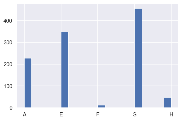
For easy reference later, these can be categorised in the data table:
[14]:
# Set groupings and label by letter
dfLong['pGroups'] = pd.cut(dfLong['redchi'], bins = np.linspace(0,1e-6,10), labels = list(string.ascii_uppercase[0:9]))

# Check result - note this is ordered by first appearance in the dataFrame, unless sorted first. Also NaNs are dropped.
dfLong['pGroups'][mask].sort_values().hist(bins=20)
[14]:
<AxesSubplot:>
Testing local and global minimum candidates
We can look more carefully by looking at the unique values within a group…
[15]:
# mask = dfLong['redchi']<3e-7
mask = dfLong['pGroups'] == 'A'

# Tabulate
print(f"Total results: {mask.sum()}, unique values: {dfLong['redchi'][mask].unique().size}")
print(dfLong['redchi'][mask].unique())

# Plot
# hv.Curve(dfLong['redchi'][mask].unique()) # Linear scale
hv.Curve(dfLong['redchi'][mask].apply(lambda x: np.log10(x)).unique())  # Log10 scale
Total results: 228, unique values: 19
[1.2604134959527601e-18 5.3106194674890043e-20 4.303597576031393e-18
 2.494886350900348e-14 1.7186846944721688e-18 8.259039836499798e-19
 1.7837416345305325e-20 1.4191997193877506e-20 7.204261384699086e-19
 7.760645030848521e-21 5.393095140259509e-28 3.345117650051837e-16
 3.7633462560795635e-22 1.5760735489756745e-22 2.469959625269985e-09
 3.4643812630697878e-22 5.7835502902223365e-24 1.2442220028745357e-18
 7.6046693509239e-23]
[15]:
For this group, the candidate parameter sets typically give orders of magnitude lower \(\chi^2\) than the higher groups, so this group is likely a genuine global minimum in the solution space. This will be investigated further below. (Note that, in this demo case where a “perfect” fit is possible, very low \(\chi^2\) values like this might be expected; more generally, with real/noisy/imperfect datasets, there may not be such an obvious “best fit” parameter grouping.)
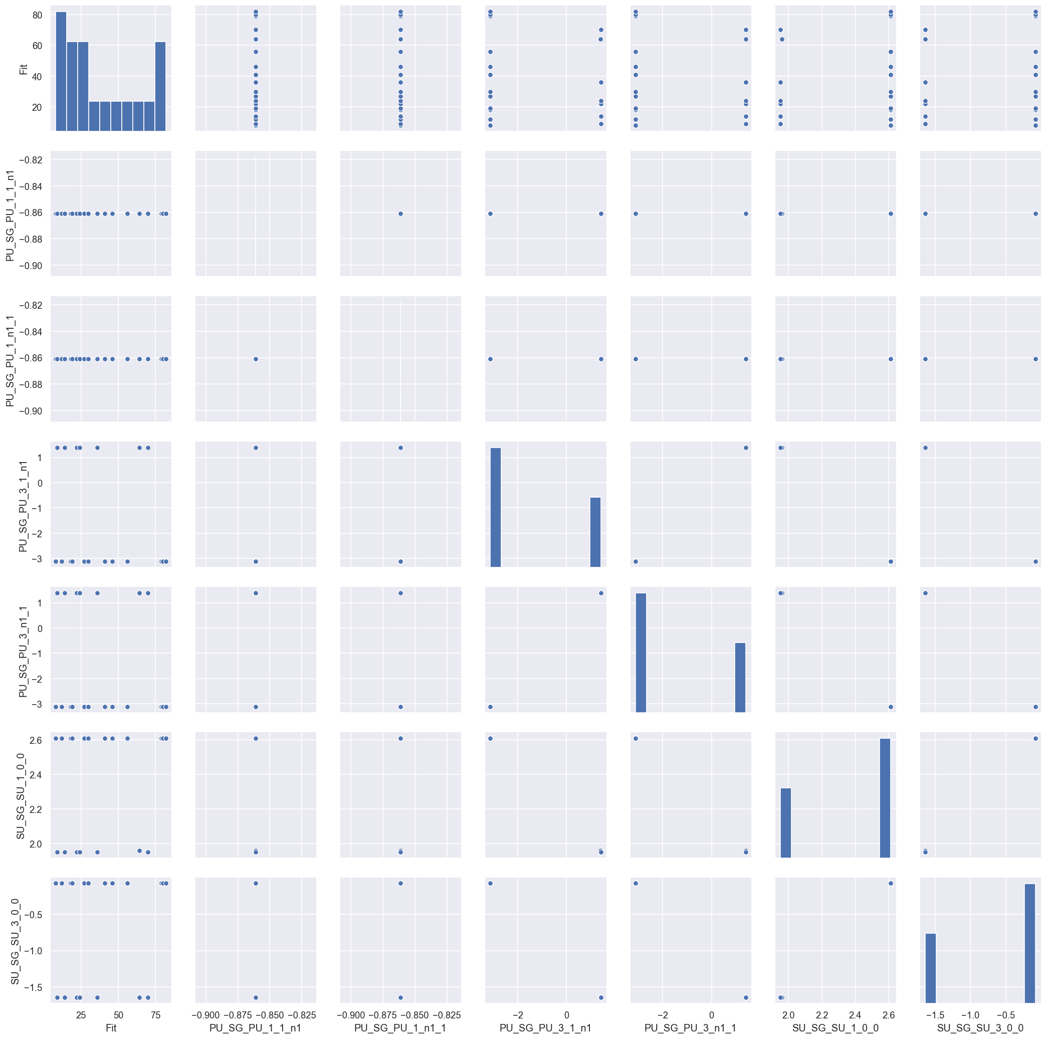
Per-fit data spread & correlations
Returning to the full batch of results, it is also useful to look at the spread and potential correlations of the paramters themselves.
[16]:
# For per-fit analysis, set also a "wide" format table
dfWide = dfLong.reset_index().pivot_table(columns = 'Param', values = ['value'], index=['Fit','Type','pGroups'],aggfunc=np.sum)

dfWide
[16]:
| value | ||||||||
|---|---|---|---|---|---|---|---|---|
| Param | PU_SG_PU_1_1_n1 | PU_SG_PU_1_n1_1 | PU_SG_PU_3_1_n1 | PU_SG_PU_3_n1_1 | SU_SG_SU_1_0_0 | SU_SG_SU_3_0_0 | ||
| Fit | Type | pGroups | ||||||
| 0 | m | E | 1.894049 | 1.894049 | 0.489781 | 0.489781 | 2.572670 | 1.352896 |
| p | E | -3.059175 | -3.059175 | -0.673191 | -0.673191 | -0.763252 | 3.120775 | |
| 1 | m | G | 1.582893 | 1.582893 | 1.150754 | 1.150754 | 2.710144 | 1.048704 |
| p | G | 2.822310 | 2.822310 | -1.145108 | -1.145108 | 0.050245 | -3.141212 | |
| 2 | m | G | 1.582889 | 1.582889 | 1.150759 | 1.150759 | 2.710143 | 1.048707 |
| ... | ... | ... | ... | ... | ... | ... | ... | ... |
| 96 | p | E | -2.675860 | -2.675860 | 1.221342 | 1.221342 | 1.311402 | -2.572625 |
| 97 | m | E | 1.894049 | 1.894049 | 0.489781 | 0.489781 | 2.572669 | 1.352897 |
| p | E | 3.038308 | 3.038308 | 0.652325 | 0.652325 | 0.742385 | 3.141543 | |
| 98 | m | G | 1.582888 | 1.582888 | 1.150761 | 1.150761 | 2.710142 | 1.048709 |
| p | G | 2.469261 | 2.469261 | 0.153500 | 0.153500 | -1.041850 | 2.149648 | |
182 rows × 6 columns
[17]:
# Look at parameter correlations

sns.pairplot(dfWide.reset_index().drop('Fit', axis=1), hue='Type') # Drop Fit #
C:\Users\femtolab\.conda\envs\ePSdev\lib\site-packages\pandas\core\generic.py:3936: PerformanceWarning: dropping on a non-lexsorted multi-index without a level parameter may impact performance.
  obj = obj._drop_axis(labels, axis, level=level, errors=errors)
[17]:
<seaborn.axisgrid.PairGrid at 0x204e828e0f0>
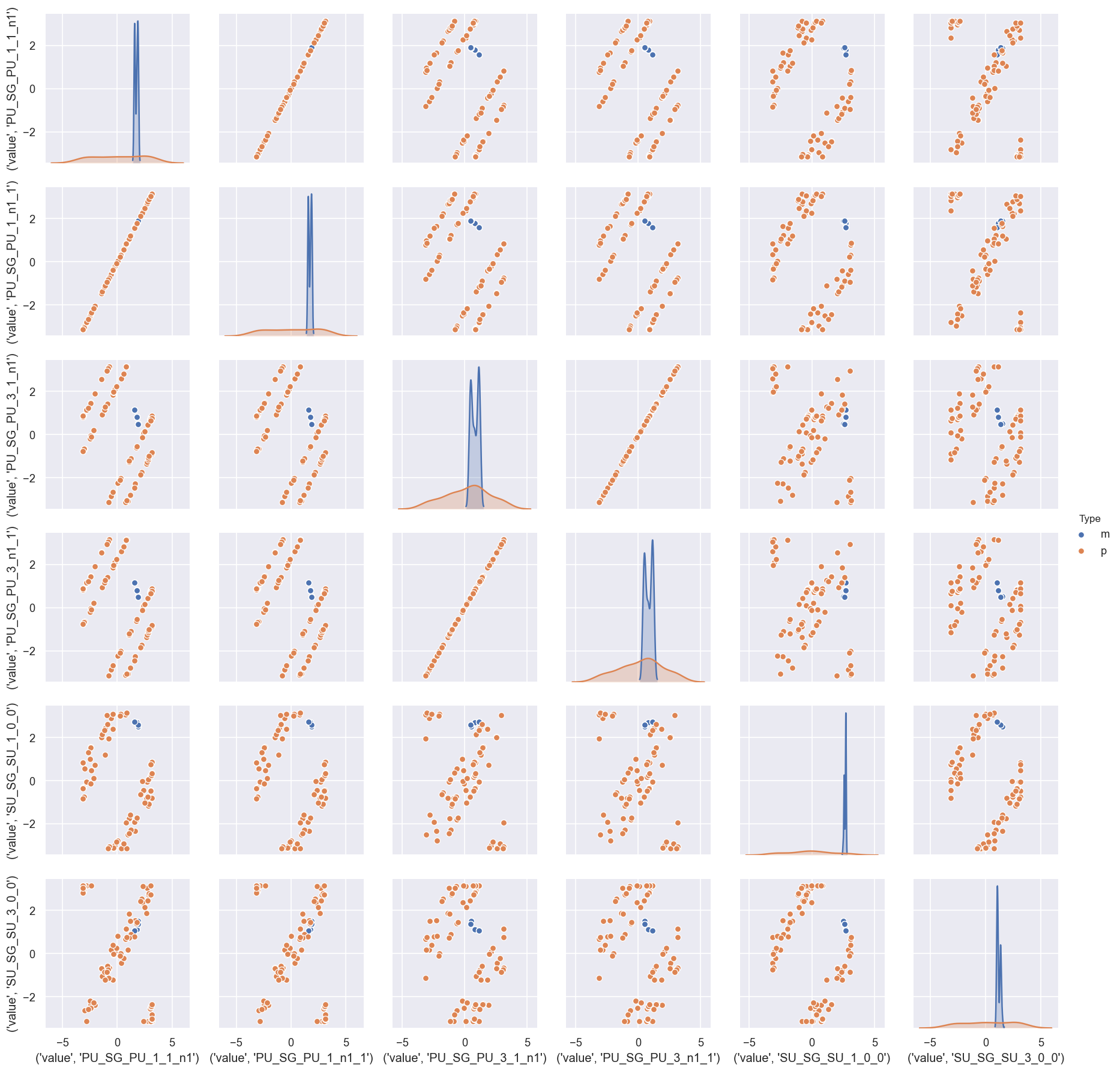
This indicates that there is generally a good (narrow) distirbution of magnitudes (m) in the batch of results, but the phases (p) are broadly distributed, although appear to be strongly correlated.
In this case, this is (somewhat) expected, since the reference phase was also randomised per fit… here the correlations are interesting however, since this indicates that (as we might hope) the relative phases are well-defined.
[18]:
dfWide['value','PU_SG_PU_1_n1_1'].xs('p',level=1).hist()
[18]:
<AxesSubplot:>
[19]:
# We can further group or filter by the defined candidate parameter sets
# sns.pairplot(dfWide.xs('m',level=1).reset_index().drop('Fit', axis=1), hue='pGroups') # Drop Fit, magnitudes only
sns.pairplot(dfWide.reset_index().drop('Fit', axis=1), hue='pGroups')
C:\Users\femtolab\.conda\envs\ePSdev\lib\site-packages\pandas\core\generic.py:3936: PerformanceWarning: dropping on a non-lexsorted multi-index without a level parameter may impact performance.
  obj = obj._drop_axis(labels, axis, level=level, errors=errors)
[19]:
<seaborn.axisgrid.PairGrid at 0x204eae25cc0>
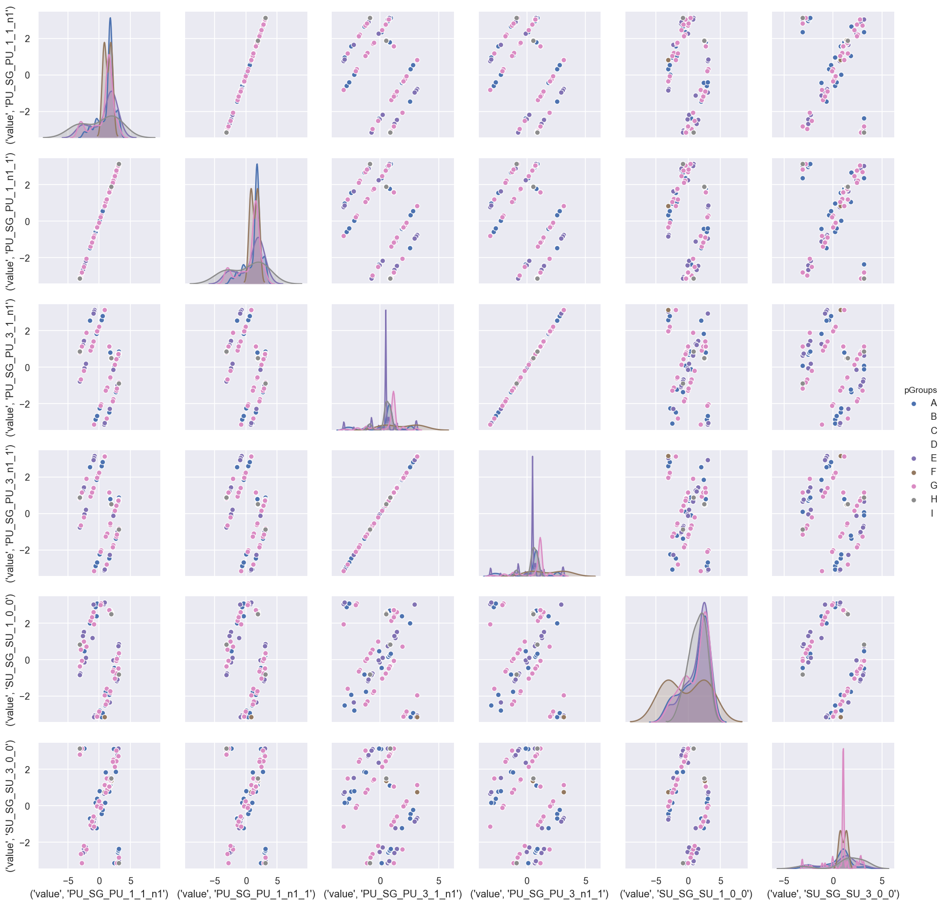
There’s a lot going on in this visualisation, but - broadly speaking - it is quite clear that the main distributions (diagonal) are group-dependent.
Model results
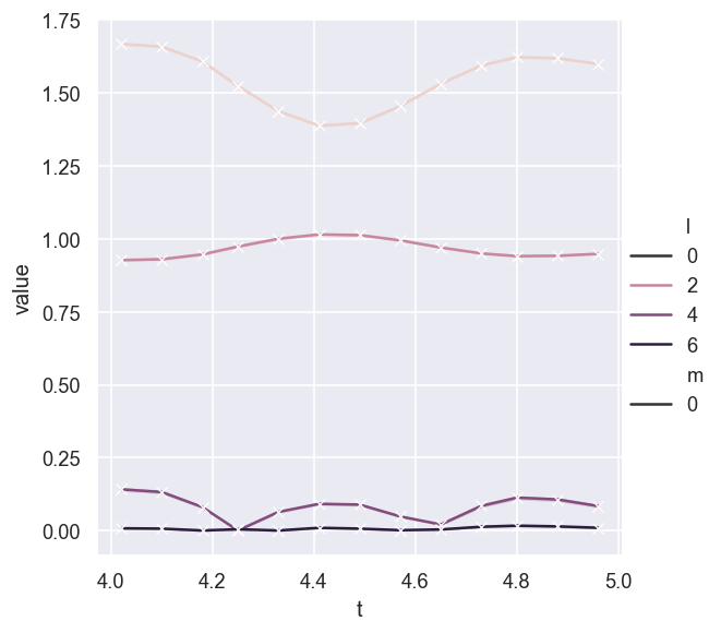
For each fit, the model output (AF-\(\beta_{LM}\) parameter) can also be investigated…
[21]:
# If Fit not mapped to style/size etc. it gives error bar
# More details at https://seaborn.pydata.org/tutorial/relational.html#aggregation-and-representing-uncertainty
sns.relplot(data = AFpdLong, x='t', y='value', hue='l', style='m', kind='line', marker = 'x')

# No error bar with this dataset?  Odd - worked in testing. Maybe only a couple of outliers/bad fits?
[21]:
<seaborn.axisgrid.FacetGrid at 0x204eb6f0fd0>
[22]:
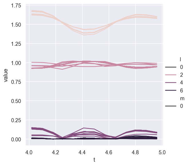
# Without aggregation and groupby Fit - this will likely make sense where there is a lot to show!
sns.relplot(data = AFpdLong, x='t', y='value', hue='l', style="m", estimator=None, units="Fit", kind='line')
[22]:
<seaborn.axisgrid.FacetGrid at 0x204ed9524e0>
[23]:
# Add pGroups to the AFBLM listing to allow for sub-selection...

# Fit > pGroups mapping, from https://stackoverflow.com/questions/58025433/drop-duplicates-based-on-first-level-column-in-multiindex-dataframe
# dfLong.reset_index().loc[dfLong.reset_index()['Fit'].drop_duplicates().index]
dfFits = dfLong.reset_index().loc[dfLong.reset_index()['Fit'].drop_duplicates().index].set_index('Fit')
AFpdLong = AFpdLong.merge(dfFits['pGroups'].reset_index(), on='Fit', how='left')

# Could also try as a mapping with a dict, https://datascience.stackexchange.com/questions/39773/mapping-column-values-of-one-dataframe-to-another-dataframe-using-a-key-with-dif
# Should be other ways too, maybe with multiindex slices?
[24]:
# Without aggregation and groupby Fit, hue by pGroups
sns.relplot(data = AFpdLong, x='t', y='value', hue='pGroups', style="l", estimator=None, units="Fit", kind='line')
# sns.relplot(data = AFpdLong, x='t', y='value', hue='pGroups', style="l", estimator=None, units="pGroups", kind='line')
# sns.relplot(data = AFpdLong, x='t', y='value', hue='pGroups', style="l", kind='line')
[24]:
<seaborn.axisgrid.FacetGrid at 0x204e82867f0>
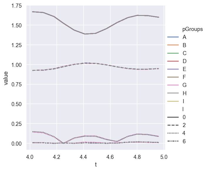
In this case - where only the best fits are assigned to groups - there is little to see or choose from!
NOTE: some work to do on the manipulation & plotting here.
Parameter estimation & fidelity
For the test case we can, of course, compare the fit results to the known input parameters. This should give a feel for how well the data defines the matrix elements (parameters) in this case…
[25]:
# For multiindex case, above code throw missing data (columns) errors, but seems OK with a reset_index()
# This basically forces the indexs to long format.
g = sns.catplot(x='Param', y='value', hue = 'Type', data = dfLong.reset_index(), kind='box')
g.set_xticklabels(rotation=-60)

# Add ref case
sns.scatterplot(x='Param', y='value', hue = 'Type', style = 'Type', data = dfRef.reset_index(), legend=False)
[25]:
<AxesSubplot:xlabel='Param', ylabel='value'>
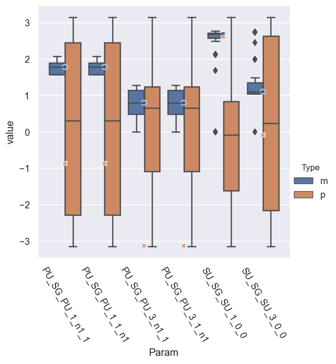
This indicates that most of the magnitudes are well-defined, with a fairly low spread of values, and averages right at the reference values, but - as per note above - the (absolute) phases are undefined. (Note the O and X markers here show the reference results.)
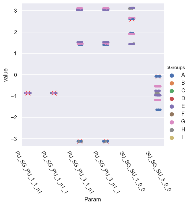
We can refine things further by applying the \(\chi^2\) maskings or groupings from above, and we’ll look at just the magnitudes. This reduces the statistical uncertainties.
[109]:
# With masking for best fits only
pType = 'm'
# mask = dfLong['redchi']<1e-5
mask = dfLong['pGroups']=='A'

# g = sns.catplot(x='Param', y='value', hue = 'Type', data = dfLong[mask].reset_index(), kind='box')
# g = sns.catplot(x='Param', y='value', hue = 'redchi', data = dfLong[mask].xs('m',level=1).reset_index(), kind='box')  # TODO: fix cmapping here to allow sub-cat
g = sns.catplot(x='Param', y='value', data = dfLong[mask].xs(pType,level=1).reset_index(), kind='box') # With mask
# g = sns.catplot(x='Param', y='value', row='pGroups', data = dfLong.xs(pType,level=1).reset_index(), kind='box')  # Rows
g.set_xticklabels(rotation=-60)

# Add ref case
# sns.scatterplot(x='Param', y='value', hue = 'Type', style = 'Type', data = dfRef.reset_index(), legend=False)
sns.scatterplot(x='Param', y='value', data = dfRef.xs(pType,level=1).reset_index(), legend=False, marker = 'x', color='red', s=50)
[109]:
<AxesSubplot:xlabel='Param', ylabel='value'>
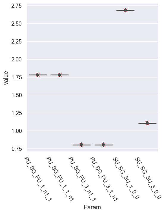
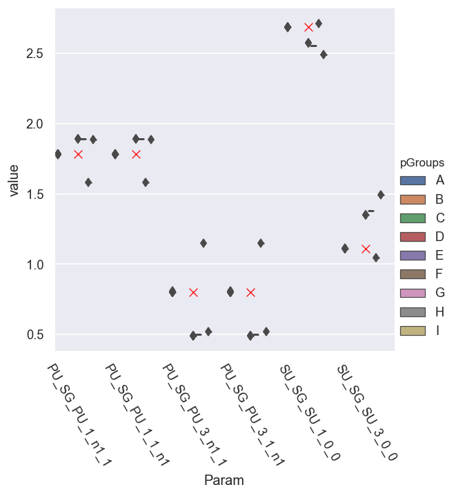
For parameter set A, things look excellent for the magnitudes.
[110]:
# With masking for best fits only
pType = 'm'
# mask = dfLong['redchi']<1e-5
mask = dfLong['pGroups']=='E'

# g = sns.catplot(x='Param', y='value', hue = 'Type', data = dfLong[mask].reset_index(), kind='box')
# g = sns.catplot(x='Param', y='value', hue = 'redchi', data = dfLong[mask].xs('m',level=1).reset_index(), kind='box')  # TODO: fix cmapping here to allow sub-cat
g = sns.catplot(x='Param', y='value', data = dfLong[mask].xs(pType,level=1).reset_index(), kind='box') # With mask
# g = sns.catplot(x='Param', y='value', row='pGroups', data = dfLong.xs(pType,level=1).reset_index(), kind='box')  # Rows
g.set_xticklabels(rotation=-60)

# Add ref case
# sns.scatterplot(x='Param', y='value', hue = 'Type', style = 'Type', data = dfRef.reset_index(), legend=False)
sns.scatterplot(x='Param', y='value', data = dfRef.xs(pType,level=1).reset_index(), legend=False, marker = 'x', color='red', s=50)
[110]:
<AxesSubplot:xlabel='Param', ylabel='value'>
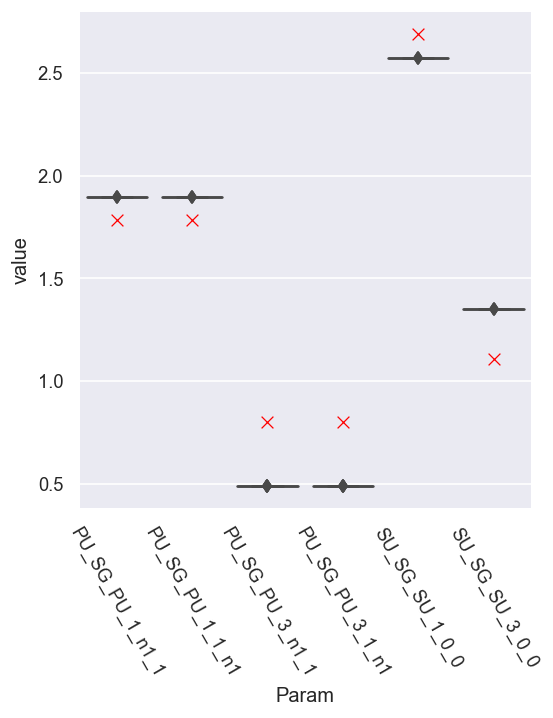
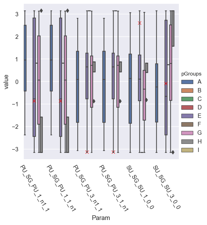
For the next-best candidates, set E, the spread in the parameters is small, but the values are a bit off from the reference case.
We can also plot all the data to get a better comparison…
[111]:
# With masking for best fits only
pType = 'm'
# mask = dfLong['redchi']<1e-5
# mask = dfLong['pGroups']=='E'

# g = sns.catplot(x='Param', y='value', hue = 'Type', data = dfLong[mask].reset_index(), kind='box')
# g = sns.catplot(x='Param', y='value', hue = 'redchi', data = dfLong[mask].xs('m',level=1).reset_index(), kind='box')  # TODO: fix cmapping here to allow sub-cat
g = sns.catplot(x='Param', y='value', hue = 'pGroups', data = dfLong.xs(pType,level=1).reset_index(), kind='box') # With mask
# g = sns.catplot(x='Param', y='value', row='pGroups', data = dfLong.xs(pType,level=1).reset_index(), kind='box')  # Rows
g.set_xticklabels(rotation=-60)

# Add ref case
# sns.scatterplot(x='Param', y='value', hue = 'Type', style = 'Type', data = dfRef.reset_index(), legend=False)
sns.scatterplot(x='Param', y='value', data = dfRef.xs(pType,level=1).reset_index(), legend=False, marker = 'x', color='red', s=50)
[111]:
<AxesSubplot:xlabel='Param', ylabel='value'>
This needs some work - but does show that the spread in the magnitudes is generally small… whilst those in the phases are large…
[113]:
# With masking for best fits only
pType = 'p'
# mask = dfLong['redchi']<1e-5
# mask = dfLong['pGroups']=='E'

# g = sns.catplot(x='Param', y='value', hue = 'Type', data = dfLong[mask].reset_index(), kind='box')
# g = sns.catplot(x='Param', y='value', hue = 'redchi', data = dfLong[mask].xs('m',level=1).reset_index(), kind='box')  # TODO: fix cmapping here to allow sub-cat
g = sns.catplot(x='Param', y='value', hue = 'pGroups', data = dfLong.xs(pType,level=1).reset_index(), kind='box') # With mask
# g = sns.catplot(x='Param', y='value', row='pGroups', data = dfLong.xs(pType,level=1).reset_index(), kind='box')  # Rows
g.set_xticklabels(rotation=-60)

# Add ref case
# sns.scatterplot(x='Param', y='value', hue = 'Type', style = 'Type', data = dfRef.reset_index(), legend=False)
sns.scatterplot(x='Param', y='value', data = dfRef.xs(pType,level=1).reset_index(), legend=False, marker = 'x', color='red')
[113]:
<AxesSubplot:xlabel='Param', ylabel='value'>
Set reference phase
In this case - with a randomised ref phase - to get the corrected (relative) fitted phase results, a reference needs to be set. (Note this can also be set for the initial fit, rather than during post-fit analysis - results should be identical.)
[136]:
# Phase correction/shift function

def phaseCorrection(dfWide, dfRef = None, refParam = None, wrapFlag = True):
    """
    Phase correction/shift/wrap function.

    Prototype from test code:

    - Assumes full Pandas tabulated wide-form dataset as input.
    - Supply dfRef to use reference phase (abs phase values), otherwise will be relative with refParam set to zero.
    - wrapFlag: wrap to -pi:pi range? Default True.

    """

    phasesIn = dfWide['value'].xs('p',level=1)  # Set phase data
    phaseCorr = phasesIn.copy()

#     print(refParam)

    if refParam is None:
        refParam = phasesIn.columns[0]  # Default ref phase

    refPhase = dfWide['value', refParam].xs('p',level=1)
#     print(refPhase)

    # For abs ref phase, set that too
#     absFlag = False
    if dfRef is not None:
        refPhase = refPhase - dfRef[dfRef['Param'] == refParam].xs('p',level=1)['value'].item()
#         absFlag = True

    print(f"Set ref param = {refParam}")

    # Substract (shift) by refPhase
    phaseCorr = phaseCorr.subtract(refPhase, axis='index')  # Subtract ref phase, might be messing up sign here?

    # Rectify phases...? Defined here for -pi:pi range.
    if wrapFlag:
        # phaseCorrRec = phaseCorr.apply(lambda x: np.sign(x)*np.mod(np.abs(x),np.pi)) # This will wrap towards zero, should be OK for zero ref phase case.

        # Use arctan, defined for -pi:pi range
        return np.arctan2(np.sin(phaseCorr), np.cos(phaseCorr))


    else:
        return phaseCorr
This defaults to setting the first phase term as the reference…
[134]:
phaseCorrection(dfWide)
Set ref param = PU_SG_PU_1_1_n1
[134]:
| Param | PU_SG_PU_1_1_n1 | PU_SG_PU_1_n1_1 | PU_SG_PU_3_1_n1 | PU_SG_PU_3_n1_1 | SU_SG_SU_1_0_0 | SU_SG_SU_3_0_0 | |
|---|---|---|---|---|---|---|---|
| Fit | pGroups | ||||||
| 0 | E | 0.0 | 0.0 | 2.385985 | 2.385985 | 2.295923 | 6.179950 |
| 1 | G | 0.0 | 0.0 | -3.967418 | -3.967418 | -2.772066 | -5.963522 |
| 2 | G | 0.0 | 0.0 | 3.967417 | 3.967417 | 2.772063 | -0.319630 |
| 3 | E | 0.0 | 0.0 | -3.897202 | -3.897202 | -3.987262 | -0.103235 |
| 4 | G | 0.0 | 0.0 | -2.315762 | -2.315762 | -3.511114 | -0.319602 |
| ... | ... | ... | ... | ... | ... | ... | ... |
| 94 | E | 0.0 | 0.0 | -2.385983 | -2.385983 | -2.295923 | -6.179951 |
| 95 | E | 0.0 | 0.0 | 2.385983 | 2.385983 | 2.295923 | 6.179950 |
| 96 | E | 0.0 | 0.0 | 3.897201 | 3.897201 | 3.987262 | 0.103235 |
| 97 | E | 0.0 | 0.0 | -2.385984 | -2.385984 | -2.295923 | 0.103235 |
| 98 | G | 0.0 | 0.0 | -2.315761 | -2.315761 | -3.511111 | -0.319613 |
91 rows × 6 columns
In general, one would set the ref. phase to zero but, for a known test case, we can also set it to the known input (reference) phase.
[132]:
phaseCorrection(dfWide, dfRef = dfRef, refParam = 'PU_SG_PU_1_n1_1')
Set ref param = PU_SG_PU_1_n1_1
[132]:
| Param | PU_SG_PU_1_1_n1 | PU_SG_PU_1_n1_1 | PU_SG_PU_3_1_n1 | PU_SG_PU_3_n1_1 | SU_SG_SU_1_0_0 | SU_SG_SU_3_0_0 | |
|---|---|---|---|---|---|---|---|
| Fit | pGroups | ||||||
| 0 | E | -0.861041 | -0.861041 | 1.524943 | 1.524943 | 1.434882 | 5.318908 |
| 1 | G | -0.861041 | -0.861041 | -4.828460 | -4.828460 | -3.633107 | -6.824564 |
| 2 | G | -0.861041 | -0.861041 | 3.106375 | 3.106375 | 1.911022 | -1.180671 |
| 3 | E | -0.861041 | -0.861041 | -4.758243 | -4.758243 | -4.848303 | -0.964276 |
| 4 | G | -0.861041 | -0.861041 | -3.176804 | -3.176804 | -4.372156 | -1.180644 |
| ... | ... | ... | ... | ... | ... | ... | ... |
| 94 | E | -0.861041 | -0.861041 | -3.247025 | -3.247025 | -3.156964 | -7.040992 |
| 95 | E | -0.861041 | -0.861041 | 1.524942 | 1.524942 | 1.434882 | 5.318909 |
| 96 | E | -0.861041 | -0.861041 | 3.036160 | 3.036160 | 3.126221 | -0.757807 |
| 97 | E | -0.861041 | -0.861041 | -3.247025 | -3.247025 | -3.156964 | -0.757807 |
| 98 | G | -0.861041 | -0.861041 | -3.176802 | -3.176802 | -4.372153 | -1.180654 |
91 rows × 6 columns
[141]:
# Full phase spread, without wrapping
phaseCorr = phaseCorrection(dfWide, wrapFlag = False)
pType = 'p'
# g = sns.catplot(x='Param', y='value', data = phaseCorr.reset_index().melt(id_vars=['Fit']), kind='box') # .melt() to force long-format
# g = sns.catplot(x='Param', y='value', data = phaseCorr.reset_index().melt(id_vars=['Fit','pGroups']), kind='box') # For pGroups case
# g = sns.catplot(x='Param', y='value', hue = 'pGroups', data = phaseCorr.reset_index().melt(id_vars=['Fit','pGroups']), kind='box') # For pGroups case
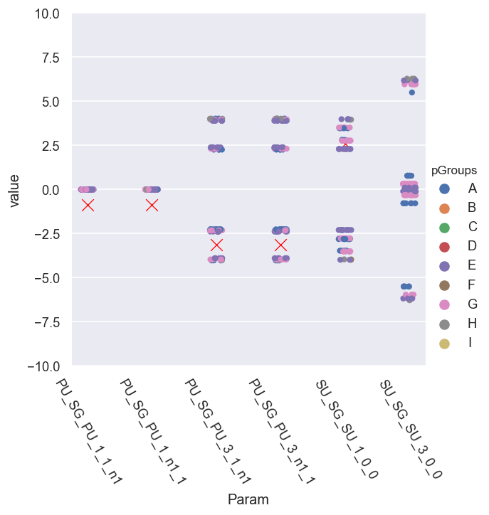
g = sns.catplot(x='Param', y='value', hue = 'pGroups', data = phaseCorr.reset_index().melt(id_vars=['Fit','pGroups'])) # pGroups + scatter plot - this shows groupings better
g.set_xticklabels(rotation=-60)
# Add ref case - note this may rescale y-axis as set
# sns.scatterplot(x='Param', y='value', hue = 'Type', style = 'Type', data = dfRef.reset_index(), legend=False)
sns.scatterplot(x='Param', y='value', data = dfRef.xs(pType,level=1).reset_index(), legend=False, marker = 'x', color='red', s=100) #, size = 10)
# Force limits
padding = 0.2
mult = 3
plt.ylim(mult*(-np.pi-padding), mult*(np.pi+padding))
Set ref param = PU_SG_PU_1_1_n1
[141]:
(-10.02477796076938, 10.02477796076938)
[142]:
# Full phase spread, WITH WRAPPING (default case)
phaseCorr = phaseCorrection(dfWide, wrapFlag = True)
pType = 'p'
# g = sns.catplot(x='Param', y='value', data = phaseCorr.reset_index().melt(id_vars=['Fit']), kind='box') # .melt() to force long-format
# g = sns.catplot(x='Param', y='value', data = phaseCorr.reset_index().melt(id_vars=['Fit','pGroups']), kind='box') # For pGroups case
# g = sns.catplot(x='Param', y='value', hue = 'pGroups', data = phaseCorr.reset_index().melt(id_vars=['Fit','pGroups']), kind='box') # For pGroups case
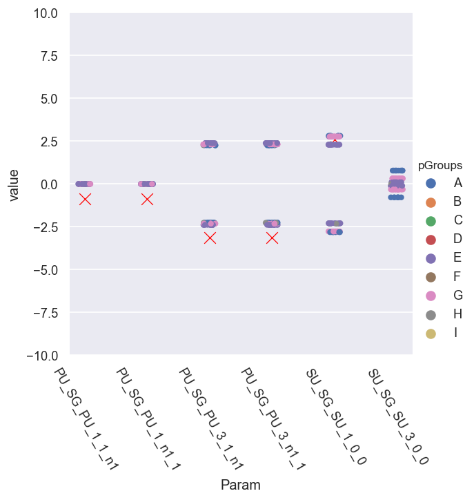
g = sns.catplot(x='Param', y='value', hue = 'pGroups', data = phaseCorr.reset_index().melt(id_vars=['Fit','pGroups'])) # pGroups + scatter plot - this shows groupings better
g.set_xticklabels(rotation=-60)
# Add ref case - note this may rescale y-axis as set
# sns.scatterplot(x='Param', y='value', hue = 'Type', style = 'Type', data = dfRef.reset_index(), legend=False)
sns.scatterplot(x='Param', y='value', data = dfRef.xs(pType,level=1).reset_index(), legend=False, marker = 'x', color='red', s=100) #, size = 10)
# Force limits
padding = 0.2
mult = 3
plt.ylim(mult*(-np.pi-padding), mult*(np.pi+padding))
Set ref param = PU_SG_PU_1_1_n1
[142]:
(-10.02477796076938, 10.02477796076938)
[144]:
# Full phase spread, WITH WRAPPING (default case) + set ref phase from known value
phaseCorr = phaseCorrection(dfWide, dfRef, wrapFlag = True)

pType = 'p'

# g = sns.catplot(x='Param', y='value', data = phaseCorr.reset_index().melt(id_vars=['Fit']), kind='box')  # .melt() to force long-format
# g = sns.catplot(x='Param', y='value', data = phaseCorr.reset_index().melt(id_vars=['Fit','pGroups']), kind='box')  # For pGroups case
# g = sns.catplot(x='Param', y='value', hue = 'pGroups', data = phaseCorr.reset_index().melt(id_vars=['Fit','pGroups']), kind='box')  # For pGroups case
g = sns.catplot(x='Param', y='value', hue = 'pGroups', data = phaseCorr.reset_index().melt(id_vars=['Fit','pGroups']))  # pGroups + scatter plot - this shows groupings better
g.set_xticklabels(rotation=-60)

# Add ref case - note this may rescale y-axis as set
# sns.scatterplot(x='Param', y='value', hue = 'Type', style = 'Type', data = dfRef.reset_index(), legend=False)
sns.scatterplot(x='Param', y='value', data = dfRef.xs(pType,level=1).reset_index(), legend=False, marker = 'x', color='red', s=100)  #, size = 10)

# Force limits
padding = 0.2
mult = 1
plt.ylim(mult*(-np.pi-padding), mult*(np.pi+padding))
Set ref param = PU_SG_PU_1_1_n1
[144]:
(-3.3415926535897933, 3.3415926535897933)
Here it looks like we have - roughly - sets of phase groups, symmetric relative to the ref. cases…
What’s going on…?
Issue with rectification?
Insensitivity to phases? (Periodicity in \(\chi^2\).)
Unsigned phases? (Periodicity in \(\chi^2\).)
Not enough sampling?
Let’s look at the correlations to see if they show anything interesting…
Looking in more detail, for set A only…
[152]:
# Full phase spread, WITH WRAPPING (default case) + set ref phase from known value
phaseCorr = phaseCorrection(dfWide, dfRef, wrapFlag = True)

pType = 'p'

# g = sns.catplot(x='Param', y='value', data = phaseCorr.reset_index().melt(id_vars=['Fit']), kind='box')  # .melt() to force long-format
# g = sns.catplot(x='Param', y='value', data = phaseCorr.reset_index().melt(id_vars=['Fit','pGroups']), kind='box')  # For pGroups case
# g = sns.catplot(x='Param', y='value', hue = 'pGroups', data = phaseCorr.reset_index().melt(id_vars=['Fit','pGroups']), kind='box')  # For pGroups case
g = sns.catplot(x='Param', y='value', hue = 'Fit', data = phaseCorr.xs('A', level=1).reset_index().melt(id_vars=['Fit']))  # pGroups + scatter plot - this shows groupings better
g.set_xticklabels(rotation=-60)

# Add ref case - note this may rescale y-axis as set
# sns.scatterplot(x='Param', y='value', hue = 'Type', style = 'Type', data = dfRef.reset_index(), legend=False)
sns.scatterplot(x='Param', y='value', data = dfRef.xs(pType,level=1).reset_index(), legend=False, marker = 'x', color='red', s=100)  #, size = 10)

# Force limits
padding = 0.2
mult = 1
plt.ylim(mult*(-np.pi-padding), mult*(np.pi+padding))
Set ref param = PU_SG_PU_1_1_n1
[152]:
(-3.3415926535897933, 3.3415926535897933)
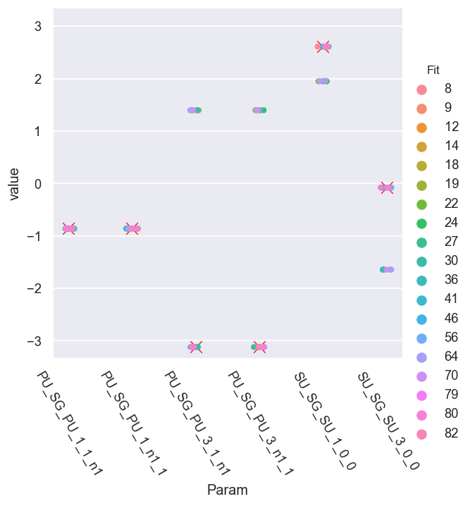
This looks promising - there seem to be two correlated sets of solutions.
We can also look at the pair plots to see the solution set correlations in more detail:
[147]:
sns.pairplot(phaseCorr.xs('A', level=1).reset_index()) #, hue='Fit')
[147]:
<seaborn.axisgrid.PairGrid at 0x20484467cc0>
[153]:
# Full set
# phaseCorr.xs('A', level=1)  #['PU_SG_PU_3_1_n1']

# Inspect unique value sets
# phaseCorrRec.xs('A', level=1).apply(np.round)  #.drop_duplicates()
phaseCorr.xs('A', level=1).apply(lambda x: np.round(x,4)).drop_duplicates()  # Get 7 sets returned down to 4 d.p. Fit 12 matches ref. values
[153]:
| Param | PU_SG_PU_1_1_n1 | PU_SG_PU_1_n1_1 | PU_SG_PU_3_1_n1 | PU_SG_PU_3_n1_1 | SU_SG_SU_1_0_0 | SU_SG_SU_3_0_0 |
|---|---|---|---|---|---|---|
| Fit | ||||||
| 8 | -0.861 | -0.861 | -3.1204 | -3.1204 | 2.6112 | -0.0787 |
| 9 | -0.861 | -0.861 | 1.3984 | 1.3984 | 1.9499 | -1.6434 |
| 64 | -0.861 | -0.861 | 1.3957 | 1.3957 | 1.9604 | -1.6421 |
This now starts to make sense… the results are showing pairs of best solutions in phase space. This is actually a good indication that the fitting routine is probing the full solution space, and things are working properly:
As expected, the
PU_SG_PU_1*variables are correlated, since this was defined for the fitting, and they take only a single value, since they were set as the reference case.The
PU_SG_PU_3*pair show mirror symmetry about the reference pair, with a +ve and -ve solution found.There are three sets of
SU_SG_SU*solutions, correlated with the +/- solutions, although two of the “unique” solutions are very close, and can be essentially regarded as defining the uncertainty in this case.The
SU_SG_SU_1_0_0solution pair seems to break the mirror symmetry (about the reference phase), but this is simply due to the wrapping of the -ve solution.
Why do we see this? For a cylindrically symmetric problem the sign of the phases is not defined, hence symmetric phase groups \(\hat{\phi_{\Gamma}} = \pm|\phi_{ref}\pm\phi_{\Gamma}|\) are therefore expected in this case, and these will produce identical results.
So, in this case, we find two good (valid) solution sets from an intial trial run of 100 fits, using 10 data points.
For this test case, it was easy to find these, since the \(\chi^2\) values were significantly lower than other candidate sets, but in general this may not be the case, and additional tests might be required, e.g. adding additional data points or testing via independent measurements. This will be explored further in the bootstrapping notebook (to follow), along with effects of noise etc.
Versions
[154]:
import scooby
scooby.Report(additional=['epsproc', 'pemtk', 'xarray', 'jupyter'])
[154]:
| Thu Jun 24 11:03:34 2021 Eastern Daylight Time | |||||
| OS | Windows | CPU(s) | 32 | Machine | AMD64 |
| Architecture | 64bit | RAM | 63.9 GB | Environment | Jupyter |
| Python 3.7.3 (default, Apr 24 2019, 15:29:51) [MSC v.1915 64 bit (AMD64)] | |||||
| epsproc | 1.3.0-dev | pemtk | 0.0.1 | xarray | 0.15.0 |
| jupyter | Version unknown | numpy | 1.19.2 | scipy | 1.3.0 |
| IPython | 7.12.0 | matplotlib | 3.3.1 | scooby | 0.5.6 |
| Intel(R) Math Kernel Library Version 2020.0.0 Product Build 20191125 for Intel(R) 64 architecture applications | |||||
[155]:
# Check current Git commit for local ePSproc version
!git -C {Path(ep.__file__).parent} branch
!git -C {Path(ep.__file__).parent} log --format="%H" -n 1
* dev
  master
  numba-tests
da12376cc36f640d8974f5ce2c121be3d391caab
[156]:
# Check current remote commits
!git ls-remote --heads git://github.com/phockett/ePSproc
# !git ls-remote --heads git://github.com/phockett/epsman
16cfad26e658b740f267baa89d1550336b0134bf        refs/heads/dev
82d12cf35b19882d4e9a2cde3d4009fe679cfaee        refs/heads/master
69cd89ce5bc0ad6d465a4bd8df6fba15d3fd1aee        refs/heads/numba-tests
ea30878c842f09d525fbf39fa269fa2302a13b57        refs/heads/revert-9-master